Conversion Rate Optimization has been one of the key focus areas for most digital-first brands and, UX now plays a huge role in driving conversions.
Many features are designed to help customers decide faster and move smoothly — like one-click checkout, which is genuinely helpful. But the line gets crossed when brands use dark patterns.
For example, showing a product at one price and then adding hidden fees at checkout makes the experience feel misleading. Or things like personalised ratings that aren’t real — they push users in a direction without honesty. Surge pricing is another one — where the cost suddenly jumps right before payment.
What may seem like a clever UX design or smart nudge can sometimes trick users into taking actions they didn’t intend to.
Read more – 4 Ways to Improve Your Ecommerce Conversion Rate
In India’s fast-growing digital market, this happens more often than we realise. Sometimes it’s innovation, sometimes desperation — but the result is the same: users lose trust. They might click once, but rarely return if they feel misled. And it’s not just small players.
Big brands like Uber have shown one fare, then quietly changed it after confirmation. Food delivery apps often add hidden “platform fees” or show inflated ratings at checkout. These tricks may drive short-term growth, but they cost long-term credibility.
The Government of India has recently released official guidelines identifying 15 dark pattern types that must be curbed, urging platforms to conduct self-audits and promote more responsible, user-friendly design practices.
In this blog, we’ll take a closer look at how well-intended UX decisions can sometimes cross the line into dark patterns — and why it’s important for businesses to design with clarity and trust in mind.
“Dark patterns don’t just mislead users — they erode trust. The government’s move to regulate them is a necessary step toward creating a more ethical and consumer-friendly digital ecosystem.”
— Karun Mehta, Partner, Khaitan & Co
Table of Contents
1. How to Identify a Dark Pattern in Your UX Design?
Not all tricky designs are easy to spot — especially when they’re built into everyday user flows. But a good way to identify a dark pattern is to ask this simple question:
“Is the user making this choice freely, or are we nudging them into it without their full understanding?”
Here are a few signs your UX might be crossing the line:
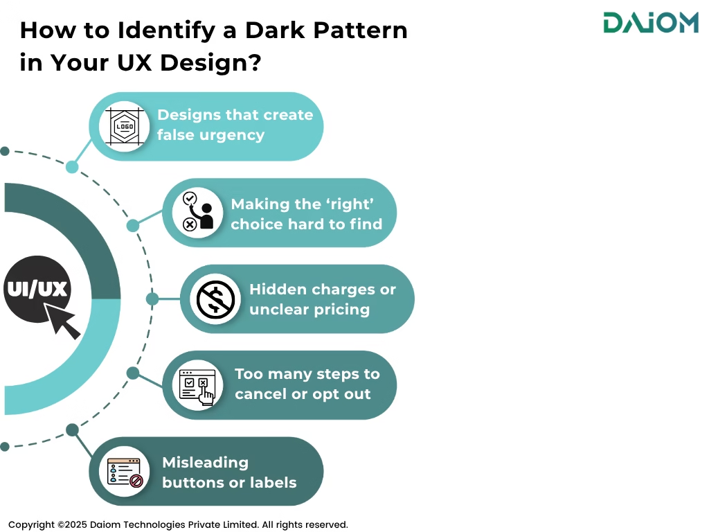
- Too many steps to cancel or opt out: If it’s harder to leave than to join, that’s a red flag.
- Misleading buttons or labels: When users click something expecting one outcome but get another — that’s trick wording.
- Hidden charges or unclear pricing: If the full cost shows up only at the final step, that’s drip pricing.
- Designs that create false urgency: “Only 1 left in stock!” — even when it’s not true — is meant to pressure users.
- Making the ‘right’ choice hard to find: Like hiding the “No, thanks” button in gray text or behind extra clicks.
A good UX builds trust by helping users make informed decisions. If your design feels like it’s tricking people — even just a little — it’s worth rethinking.
2. Why Are Dark Patterns a Problem in UX?
Great UX is supposed to make things easier for the user. But dark patterns twist that idea — they guide users toward actions that benefit the brand, not the customer.
Dark patterns are challenging because they focus on quick gains like clicks or sign-ups, while risking long-term trust and customer loyalty. It could be hiding the “cancel” button, auto-selecting paid add-ons, or showing inflated personalized ratings.
These tricks might help brands get more clicks today, but they can make people stop trusting the brand later. In India, where many people are still getting used to apps and websites, being clear and honest matters more than being too clever.
If people feel misled even once, they often don’t come back, leading to lower repeat rate. That’s why brands should focus on building trust, not using tricks to get clicks..
Read more – Everything You Need to Know About Repeat Customer Rate
3. 14 UX Dark Patterns That Break Trust and Hurt User Experience
In UX, every design choice should help users — not trick them. But sometimes, designs are made in a way that pushes people into doing things they didn’t plan to do. These are called dark patterns.
They look like regular features but are actually used to confuse or pressure users. This doesn’t just hurt the experience — it can lead to lost trust, frustration, and even financial loss.
Below are 15 common dark patterns that companies use:
1. Bait and Switch
You are shown one thing (usually a better deal), but once you engage, it gets replaced with something less appealing.
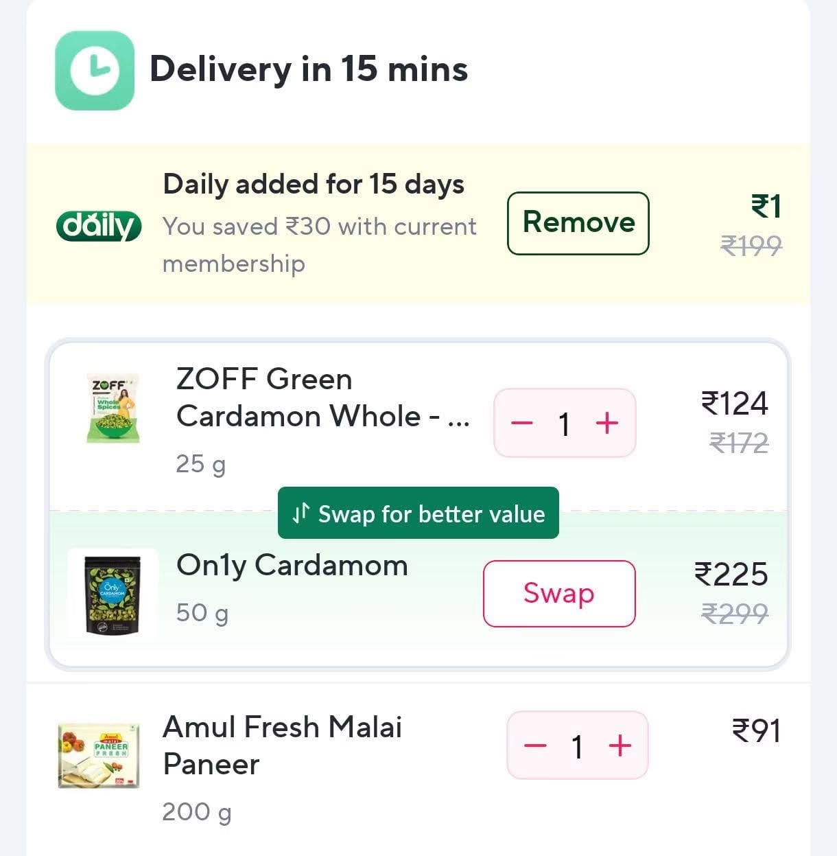
Example: Zepto shows a lower-priced product (ZOFF Cardamom) in your cart, then prompts you to “Swap for better value” — which actually suggests a more expensive item (On1y Cardamom). It’s an example of Bait and Switch, nudging users toward costlier choices under the guise of value.
2. Surge Pricing
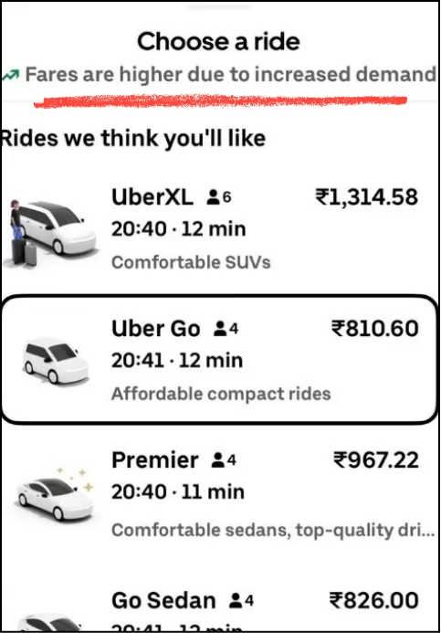
Surge Pricing is a tactic where additional costs are introduced late in the purchase journey — usually at the final step, like payment — after the user has already invested time and made a decision. This sudden price increase often feels unavoidable, leaving users with little choice but to accept it.
Example: Uber’s Surge Pricing is a classic example of a forced cost add-on, where fares increase during high-demand periods without clear upfront disclosure. Users often see a much higher fare only after entering their destination, making the final price feel sudden and unavoidable.
3. Personalised Rating
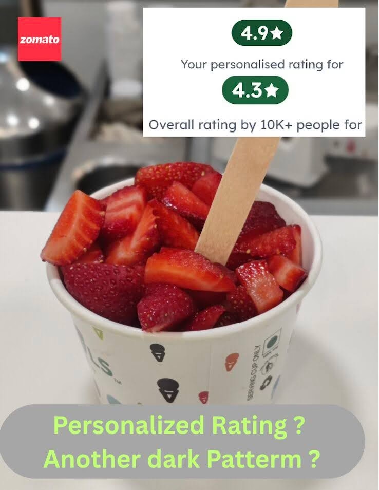
One of the common dark patterns is you are shown a higher personalized rating instead of the actual average rating to influence your decision.
Platforms use your past orders or preferences to display a rating customized just for you — not the real average rating across all users. This creates a false sense of trust or quality, subtly nudging you to reorder or choose that product again.
For example: You regularly order from a restaurant, and the app shows you a 4.9 rating. But the actual average rating for all users is 4.4 — your view is customized based on your past behavior to make the restaurant look better to you.
4. Couponing
This pattern uses misleading discount claims to grab attention — like “Get up to 50% off!” — but hides the real value in fine print.
For Example: Zomato often promotes “Up to 50% Off” on orders. But when you apply the coupon, you realise it’s capped at ₹50 — even if your order is ₹500 or more. That’s not 50% off — it’s just 10% of what you were led to expect, and less than 1% of your actual order value.
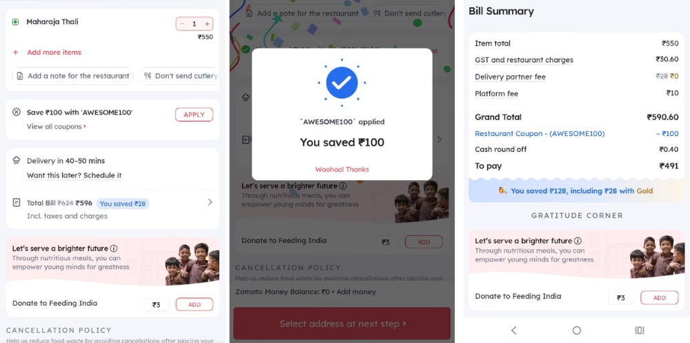
Here, Zomato’s goal is to create urgency and inflate perceived savings, even when the real benefit is minimal. It feels like a deal — until you understand the dark pattern.
5. Misleading Delivery Time Estimates
This dark pattern sets false expectations by promising ultra-fast delivery times to boost conversions — knowing well that actual delivery takes much longer.
For example: Zepto often shows items as “Available in 6 minutes” to create a sense of speed and convenience. But in reality, deliveries often take 15-20 minutes or more.
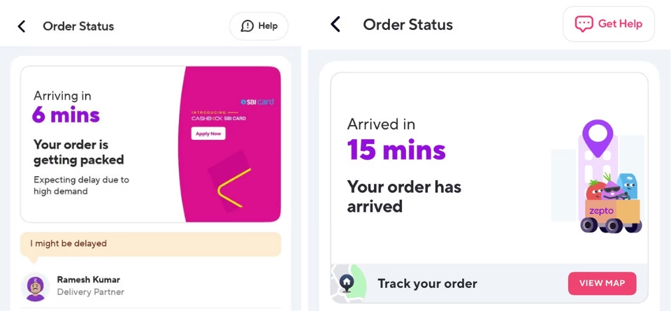
While delivery partners are doing their best, the promised time was never realistic to begin with.
6. Interface Interference
Websites often use confusing or misleading designs—like hiding important buttons or options—to push you into making choices you might not otherwise agree to. These tricks are subtle but intentional, aimed at influencing your decision without your full awareness.
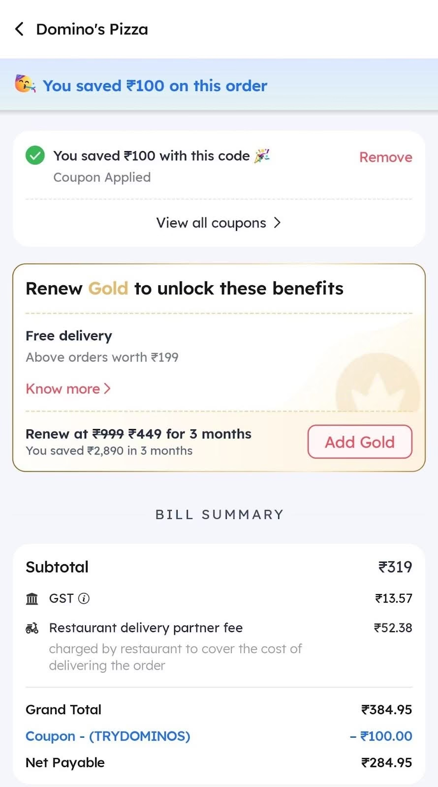
For Example: Even though it shows you saved ₹100 using a coupon, the restaurant delivery partner fee quietly jumps up—making the savings less meaningful. The design highlights the discount brightly, while the extra fee is in small, grey text. This tricks users into feeling like they got a better deal than they actually did.
7. Basket Sneaking
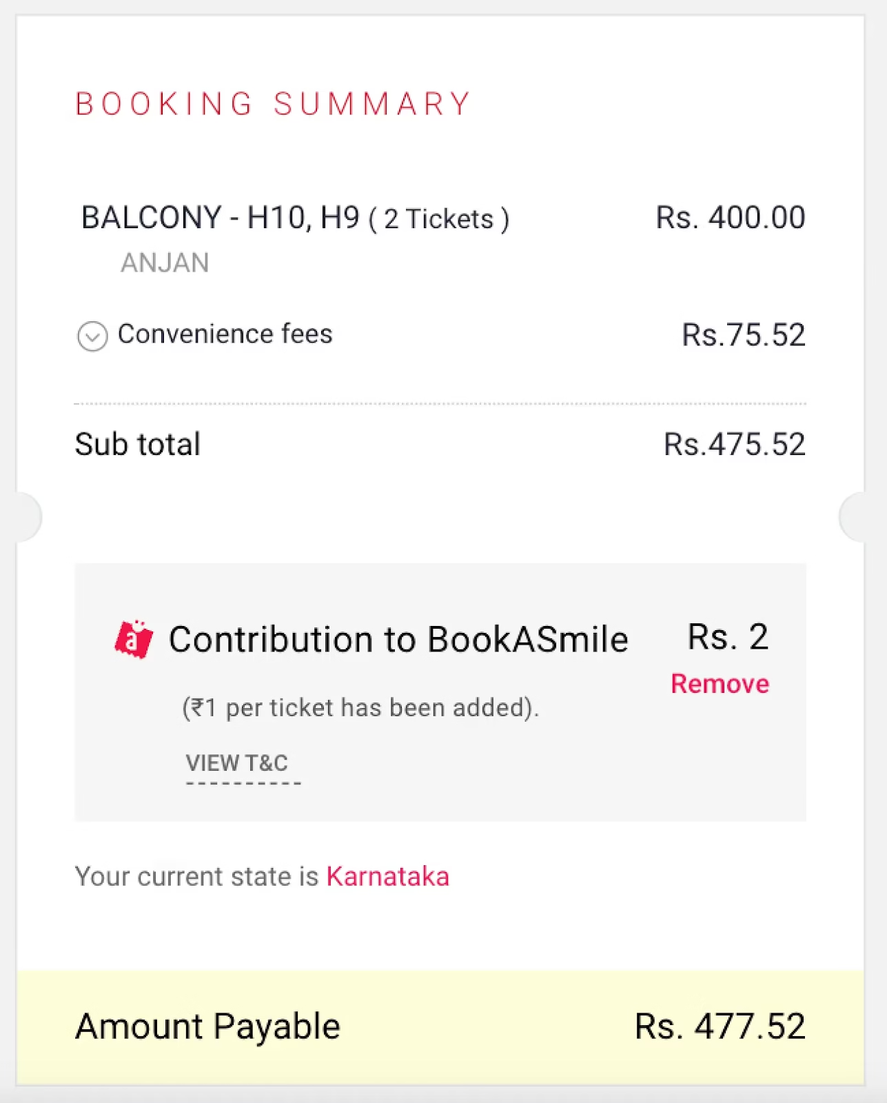
Extra items or services are added to your cart during checkout without your clear consent, raising the total price unexpectedly.
For Example: While booking movie tickets on BookMyShow, I noticed ₹2 was quietly added for a donation under “BookASmile” without me opting in. This is a classic example of basket sneaking—where extra charges are added during checkout without clear consent.
8. False Urgency
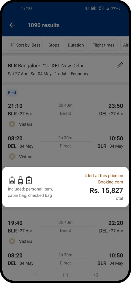
This tactic uses fake urgency to rush decisions, making users feel they’ll lose out if they don’t act immediately. It’s designed to trigger impulse actions rather than thoughtful choices.
For Example: Booking.com often displays messages like “Only 1 room left!” or “Booked 5 times in the last hour!” while you browse. These alerts create pressure to book quickly — even if the urgency isn’t real — pushing users to decide faster out of fear of missing out.
9. Confirm Shaming
This uses guilt or emotional pressure to nudge you into saying “yes” to an offer by making the alternative sound negative or selfish.
For Example: Instead of offering a neutral option like “No, I don’t want travel assistance,” it says “No, I will take risk.” The language is designed to make you feel irresponsible or unsafe for not opting in. It’s subtle, but it pushes you toward the paid choice using emotional pressure rather than informed consent — which makes the experience feel manipulative rather than user-friendly.

10. Disguised Ads
Advertisements are designed to look like real content, news articles, or user reviews, so you click them without realizing it’s an ad.
For Example: While checking out Times of India, I came across an article titled “Why Brainware is the Toppers’ Choice?” appears right in the middle of real news stories. It’s marked as “Sponsored”, but the format, layout, and placement make it look just like a regular news headline.

11. Nagging
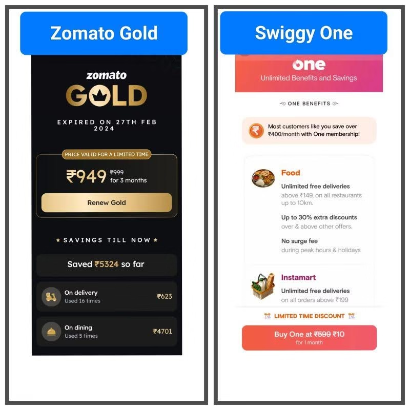
Pop-ups or prompts keep reappearing repeatedly, trying to wear you down into accepting a service or feature.
Example: Zomato and Swiggy keep pushing membership offers even after skipping them. These repeated prompts are classic examples of nagging. Here, Zomato shows the expired Gold plan with a push to “Renew Now.” Swiggy highlights a ₹10 discount and “limited time” tag to create urgency. These constant nudges wear customers down.
12. Trick Wording
This uses confusing language — like double negatives — to make it unclear what option you’re choosing.
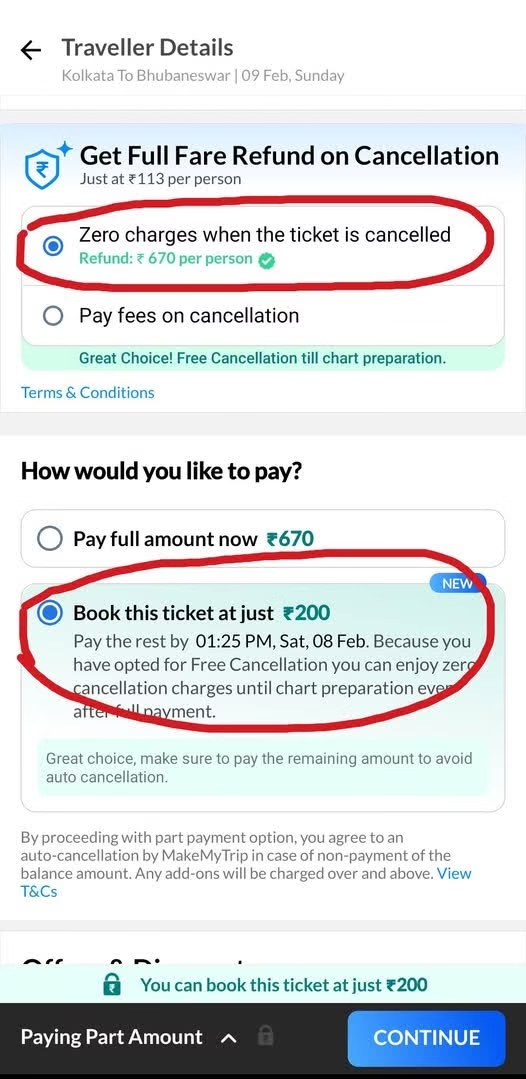
For Example: MakeMyTrip highlights “Zero charges” and “Refund: ₹670 per person,” making users believe they’ll get a full refund. But after paying ₹200 to book, they later discover that cancellation fees still apply — the “FREE cancellation” only covers support. The real deductions are revealed only during or after cancellation.
13. SaaS Billing
Software platforms auto-renew your subscriptions without a clear alert or reminder before billing you again.
For Example: Value-Added Services (like ringtones, astrology, or news alerts) are sometimes opted in via one accidental tap or even without user awareness.
14. Rogue Malware
You’re tricked into downloading something harmful, often through a link that promises helpful content.
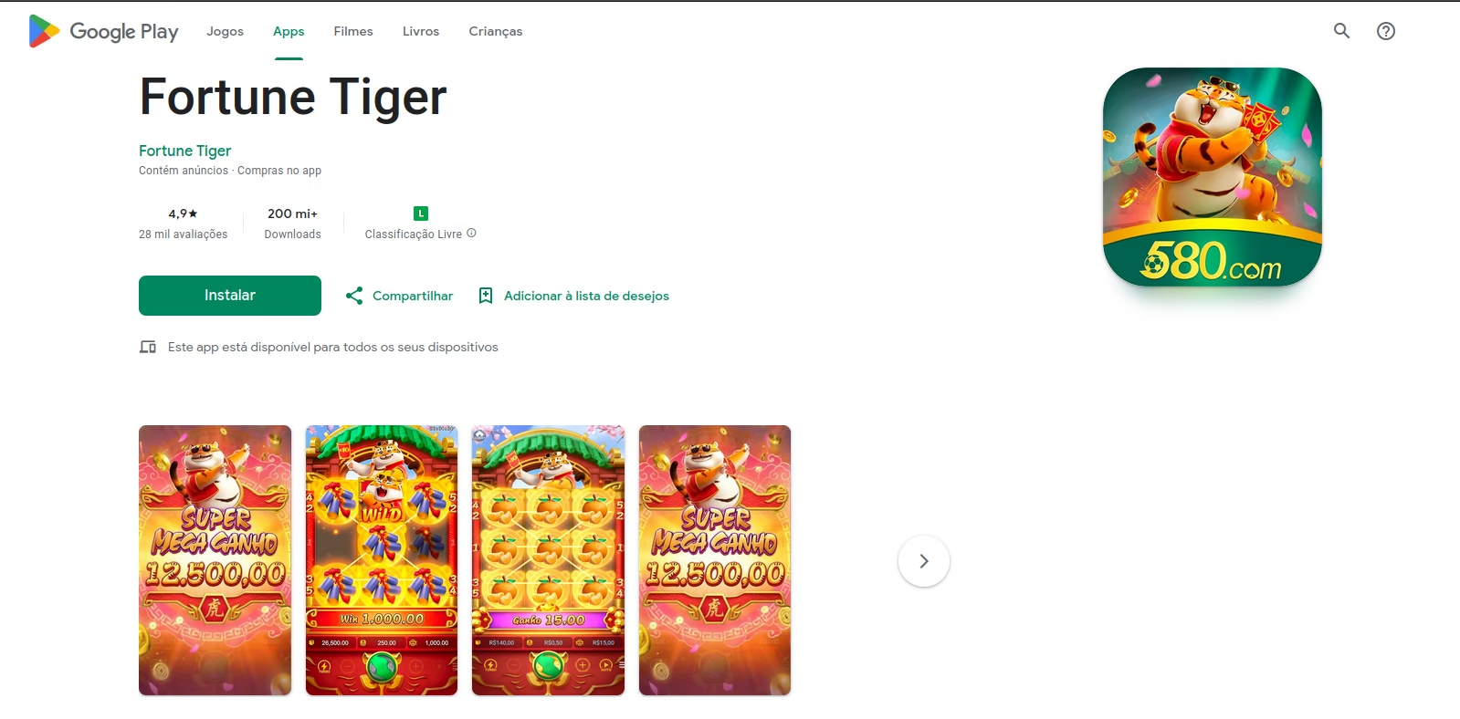
For Example: Scammers created a fake website mimicking the Google Play Store to promote the Fortune Tiger app. It looked official but downloaded a rogue APK instead, exposing users to data theft and malware.
“Dark patterns don’t just trick users — they break trust. Ethical design isn’t optional; it’s the foundation of long-term customer relationships.”
— Rahul Matthan, Partner, Trilegal & Tech Policy Expert
4. How to Design Ethically Without Losing Conversions?
You don’t have to choose between good ethics and good business. In fact, ethical UX often leads to better long-term growth. Here’s how you can design experiences that are both honest and high-converting:
- Be clear: Use simple language, clear CTAs, and transparent pricing to help users feel in control.
- Give real options: Always provide a clear opt-out — don’t hide “No, thanks” buttons or use guilt tactics.
- Nudge at the right time: Ask for reviews, sign-ups, or upgrades only when it makes sense in the user journey.
- Be transparent: Show full costs, terms, and commitments upfront — no last-minute surprises.
- Think like your user: Think from the user’s point of view — what would feel fair, honest, and respectful?
5. Conclusion
Great UX isn’t just about conversions — it’s about creating experiences that users trust and enjoy. Dark patterns may give a short-term boost, but they come at the cost of long-term loyalty. In a country like India, where millions of new users are coming online, the responsibility to design clearly and ethically is even greater. Good design helps people make better choices — not manipulated ones. And when people feel respected, they come back.
So, if you’re designing for growth, make trust your strongest UX strategy.
For more informative content and blog, follow and stay tuned to DAiOM.
Subscribe to our NEWSLETTER!


