Data visualization is essential for cultivating a data-driven culture within organizations. It helps by converting complex data into understandable KPIs and dashboards, making it easier for everyone in the organization to access and interpret the information. This accessibility supports better decision-making and promotes a more data-informed environment.
You can achieve simplicity in the design of effective charts, graphs and tables by remembering three fundamental principles: restrain, reduce, emphasize.
Garr Reynolds
Historically, BI tools were expensive and primarily used by large companies due to their high costs. However, with the rise of cloud technology and the availability of more affordable tools, BI solutions are now accessible to businesses of all sizes. This shift has made it easier for organizations to integrate data visualization into their workflows.
The future of BI tools is likely to be shaped by advancements in data storytelling and artificial intelligence. Effective data storytelling involves using visual elements to convey insights clearly and compellingly. AI is expected to enhance BI tools by enabling more intuitive queries and providing automated insights.
Some of the leading tools include:
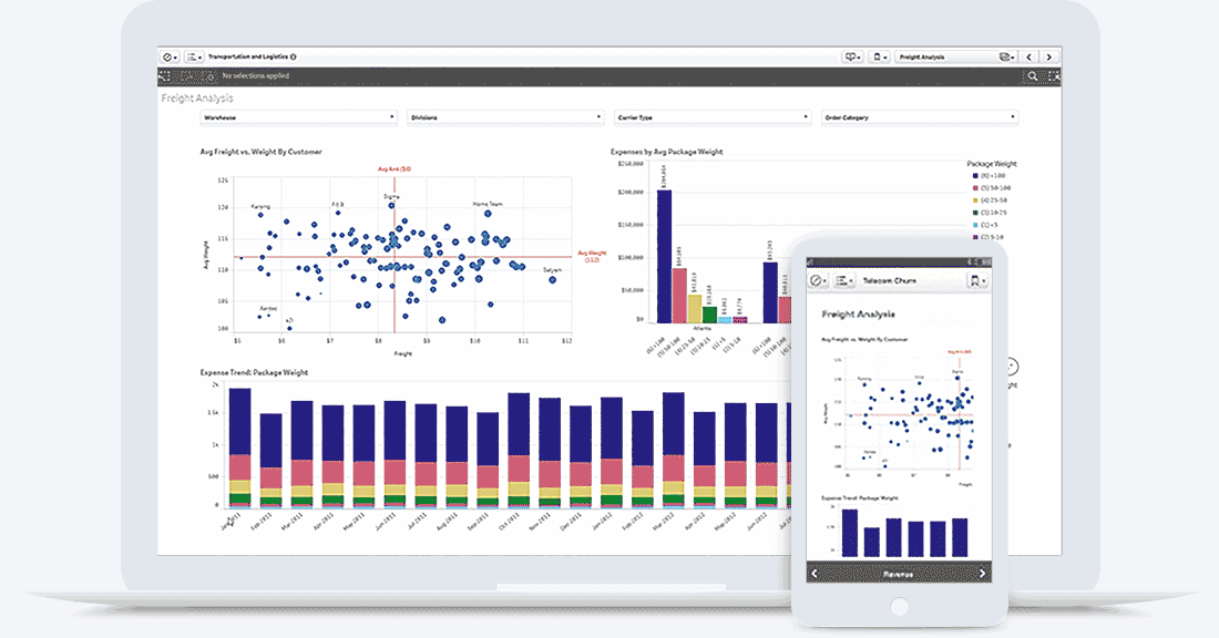
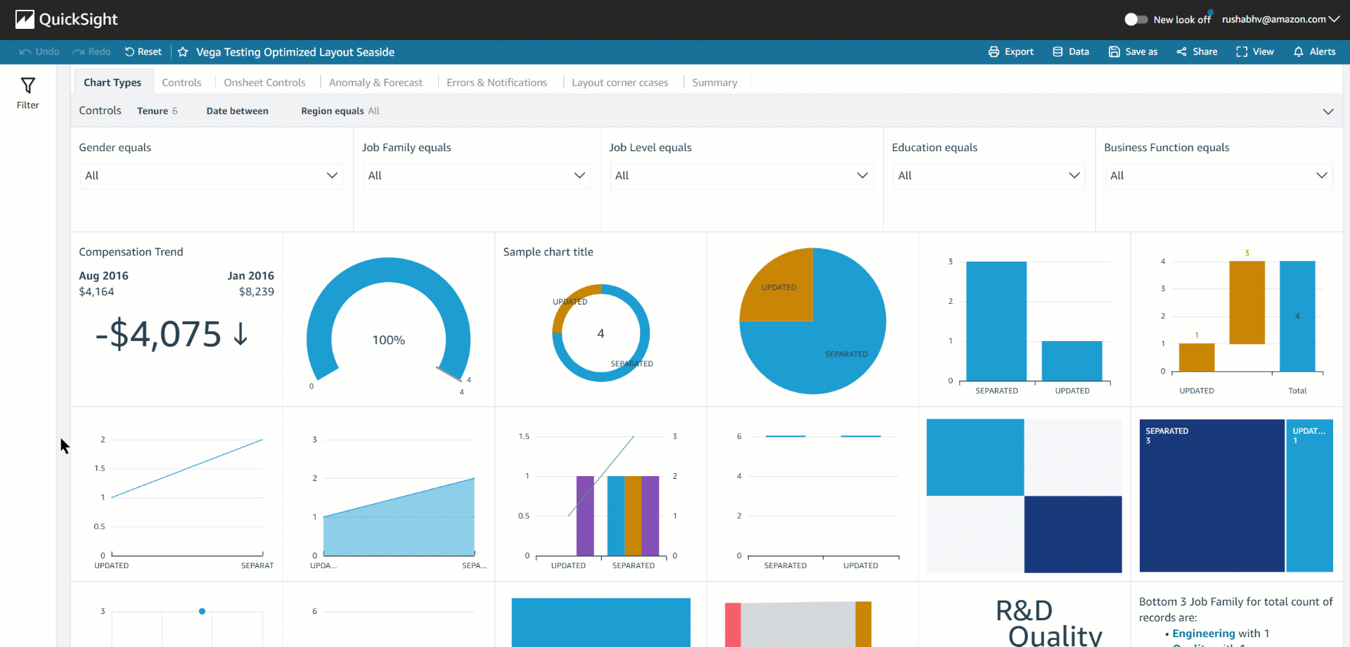
- Amazon QuickSight : Known for its broad range of services and integration capabilities.
- Tableau: Offers powerful visualization and analytics features and has been acquired by Salesforce, enhancing its integration with Salesforce’s ecosystem.
- Power BI: A cloud-native tool with strong connectivity across platforms, particularly with Azure. It is popular for its user-friendly interface and powerful visualization options.
- Google Looker Studio: Provides robust connectors with Google Analytics and offers a competitive pricing model, including a free version for basic use.
- Qlik Sense: Known for its associative data model and strong visualizations, making it a strong contender in the BI space.
As a continuation of the MarTech blog series, let’s look at the data visualization tools that are versatile, user-friendly, advanced and offer multiple ways to visualize data.
Table of Contents
1. What is Data Visualization?
Data visualization is defined as the graphical representation of data and information. Business owners and employees can use visual elements like charts, graphs, and maps to spot trends, outliers, and patterns through data visualization tools. It’s a great way to present data clearly to their audiences.
2. Why Does Data Visualization Matter?
Blending creative storytelling with technical analysis is essential today, and data visualization lies at the intersection of these two skills, making it a valuable asset that helps automate the data reporting process.
Data visualization is crucial because it helps people understand and interact with data. It makes complex information clear, no matter the expertise level. Creating visuals, whether in dashboards or presentations, helps make the most of the information.
As data becomes more central to decision-making, being able to visually tell a story is increasingly valuable. Almost every industry benefits from better data understanding. Whether it’s STEM, finance, Omnichannel, Analytics, AI, marketing, government, education, or sports, clear data is a game-changer.
3. Types of Data Visualization
Here are some common ways to represent data visually:
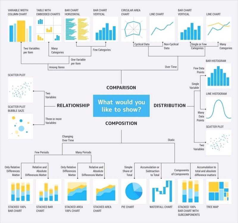
- Dashboard: Combines multiple visualizations and data in one view for easy analysis and presentation.
- Geospatial: Shows data on a map with shapes and colors to highlight relationships and locations.
- Area Map: A type of geospatial visualization that displays values over geographic areas, like countries or states.
- Heat Map: A geospatial visualization that uses colors to show data values on a map.
- Chart: Displays information on a graph, diagram, or map with data shown on two axes.
- Bar Chart: Represents numerical values with bars, where the length indicates the value of each variable.
- Pie Chart: A circular chart with segments showing data as a percentage of a whole.
- Infographic: Blends visuals and text to represent data, often using charts or diagrams.
- Graph: Uses points, lines, or curves to compare variables on two axes.
- Histogram: A type of bar chart that splits continuous measures into bins to analyze distribution.
- Box-and-Whisker Plot: Shows ranges and distributions across a measure, using a box and lines.
- Bullet Graph: A bar marked against a background to show progress or performance relative to a goal.
- Gantt Chart: Used in project management, it displays timelines and tasks as bars.
- Highlight Table: A table that uses color to categorize data for easier reading.
- Treemap: Shows related values in rectangles nested within each other.
4. Current Demographic of BI Tools
The image below presents the current demographic of Business Intelligence (BI) users who utilize data visualization tools, as reported on the G2 website.
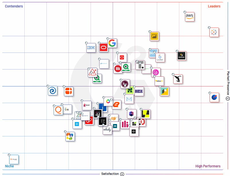
The grid shows that the top tools with Good Satisfaction Rate and High Market Presence are Leaders – “Power BI”, “Amazon QuickSight”, “Tableau”, “Google Looker”, “Qlik Sense”
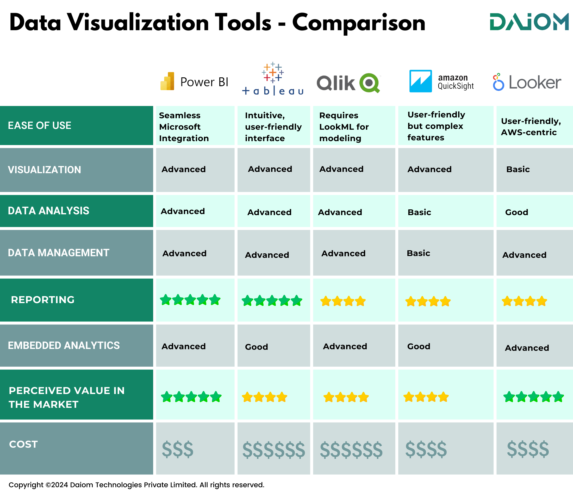
5. Top Tools Used For Data Visualisation
Here are some of the top data visualization tools widely used in the omnichannel, Martech and other industries to visualize data and deliver valuable marketing insights.
5.1 Power BI
Power BI is Microsoft’s business analytics tool designed for visualizing and sharing data insights. Since its launch in 2014, it has rapidly gained traction in the BI market. By 2023, Power BI had over 5 million subscribers globally, holding approximately 36% of the market share in the BI and analytics platforms segment.
Key Features of Power BI
- Seamless Microsoft Integration: Power BI works smoothly with Microsoft tools like Excel, Azure, and SQL Server, making it ideal for businesses using Microsoft services.
- Advanced Data Modeling: It supports powerful data modeling, allowing users to build complex relationships and perform detailed calculations with DAX (Data Analysis Expressions).
- Real-Time Data Access: Power BI connects to various data sources, providing real-time insights that are crucial for quick, informed decisions.
- Custom Visualizations: Users can choose from a range of visual options and create custom visuals using the Power BI Visuals SDK.
- Scalable and Secure: Designed for large organizations, Power BI offers robust security and compliance features.
What Do We Love About Power BI?
Power BI is a part of Microsoft, it offers seamless integration with Azure, offers on-premise deployment, is cost-effective with the option to start with just one license, and provides excellent compatibility with Microsoft systems.
Things to Watch Out For
- Complexity for Beginners: While Power BI is user-friendly, its advanced features and data modeling can be tough for beginners without adequate training.
- Customization Limits: Power BI is customizable, but it may fall short compared to tools like Tableau for very specific visualization needs.
- Internet Dependence: Reliable internet is crucial for accessing cloud-based features and real-time data updates.
5.2 Tableau
Tableau, established in 2003 and acquired by Salesforce in 2019, is a top data visualization and analytics platform. By 2023, Tableau boasted over 1 million active users across 80,000+ customer accounts globally, holding around 15-20% of the market share in the BI and analytics platforms sector.
Key Features of Tableau
- Ease of Use: Tableau is known for its intuitive interface, making it easy for users to create complex visualizations without needing deep technical expertise.
- Advanced Visualization: It offers a wide variety of chart types and customization options, allowing users to build highly interactive and tailored dashboards.
- Strong Community Support: Tableau has a thriving user community that shares knowledge, tips, and best practices, offering valuable support for both new and experienced users.
- Tableau Mobile App: Available for iOS and Android, the Tableau Mobile app lets users access dashboards and visualizations on the go, connecting to Tableau Server or Tableau Online for flexibility and convenience.
What Do We Love About Tableau?
Tableau is a powerful tool with advanced data visualization capabilities, offers excellent native connectors with Salesforce, is easy for beginners to use, although it can be costly.
Things To Watch Out For
- Cost: Tableau can be more expensive than some competitors, which may be a concern for small businesses or those with limited budgets.
- Learning Curve: While basic features are easy to use, mastering Tableau’s advanced functions may require extra training or experience.
- Data Preparation: Tableau’s data preparation capabilities are not as robust as some other tools, often necessitating the use of additional software to clean and prepare data before importing it into Tableau.
5.3 Google Looker
Formerly known as Google Data Studio, Google Looker, founded in 2012 and acquired by Google in 2019, is a cloud-based business intelligence and big data analytics platform. By 2023, Looker had over 2,000 customers globally. Although specific market share data is limited, Looker has experienced rapid growth, especially in the cloud-based BI sector since its acquisition by Google.
Key Features of Looker
- Data Modeling with LookML: Looker uses LookML, a modeling language that lets users define data relationships, calculations, and metrics in a reusable, scalable way, ensuring consistent and accurate analysis across the organization.
- Seamless Cloud Integration: Looker integrates seamlessly with Google Cloud, BigQuery, and other cloud services, making it ideal for organizations using cloud-based data infrastructure.
- Embedded Analytics: Looker supports embedded analytics, allowing organizations to integrate data insights directly into their applications and workflows.
- Collaboration and Sharing: Looker enhances collaboration by enabling users to easily share reports and dashboards, fostering a data-driven culture throughout the organization.
What Do We Love About Looker?
Google Looker Studio has excellent native integrations with Google Analytics, a strong freemium offering that provides the first year for free to help you build seamless dashboards, along with its cloud-first approach.
Things To Watch Out For
- Learning Curve with LookML: While LookML is a powerful tool, it may be challenging for users unfamiliar with data modeling or scripting languages.
- Cost: Looker’s pricing can be high, which might be a concern for smaller organizations or those with tight budgets.
- Dependency on Cloud Infrastructure: Organizations that rely on on-premises solutions may find Looker’s cloud-centric approach difficult to integrate with their existing systems.
- Limited Offline Functionality: Looker’s dependence on internet connectivity can be a drawback for users who need offline access to data and insights.
5.4 Qlik Sense
Qlik Sense, launched by Qlik Technologies in 2014, is a contemporary data analytics and visualization platform. By 2023, Qlik reported over 50,000 customers across more than 100 countries. Although precise market share data is limited, Qlik is recognized as a significant player in the BI market, with an estimated share of 5-10% in the BI and analytics platforms segment.
Key Features of Qlik Sense
- Associative Data Engine: Qlik Sense’s unique associative data model lets users explore data freely, without predefined paths, for more intuitive and thorough data discovery.
- Self-Service Analytics: It empowers users with self-service analytics, allowing non-technical users to create and customize their own dashboards and visualizations independently of IT or data experts.
- Smart Visualizations: Qlik Sense offers intelligent and responsive visualizations that adjust to the data context, making complex information easier to interpret and understand.
What Do We Love Qlik Sense?
Qlik Sense is ideal for enterprises seeking on-premise deployment, providing robust analytics and data visualization capabilities.
Things To Watch Out For
- Complexity for New Users: Although user-friendly, new users may find Qlik Sense’s advanced features and data modeling complex, necessitating time and training to master.
- Resource Intensive: Qlik Sense’s associative data engine can be demanding on hardware and infrastructure, especially with large datasets.
- Learning Curve for Scripting: Performing complex data transformations or scripting may require learning Qlik’s scripting language, which can be challenging for some users.
5.5 Amazon Quicksight
Amazon QuickSight, launched by Amazon Web Services (AWS) in 2016, is a cloud-based business intelligence service designed to deliver fast and responsive data visualizations. By 2023, QuickSight had grown to support thousands of users across various industries, leveraging its deep integration with AWS and scalability for organizations of all sizes.
Key Features of Amazon QuickSight
- Serverless and Scalable: QuickSight is a fully managed service that automatically scales based on your usage, making it cost-effective and hassle-free.
- ML-Powered Insights: QuickSight integrates machine learning to automatically discover hidden trends, anomalies, and patterns in your data, without needing manual setup.
- QuickSight Q: Allows users to type questions in natural language and receive visual answers instantly, making data analysis more accessible to non-technical users.
- Interactive Dashboards: QuickSight provides interactive dashboards that users can embed into applications, making it easy to share insights across the organization.
- Embedded Analytics: With its deep integration with AWS, QuickSight allows you to embed rich analytics directly into your applications, providing a seamless user experience.
What Do We Love About Amazon Quicksight?
Provides scalable, cost-effective analytics with fast performance, accessible from various devices, supports large data sets, and has customizable dashboards with diverse visualizations.
Things To Watch Out For
- Learning Curve for Advanced Features: While QuickSight is user-friendly, mastering its advanced features, especially the machine learning aspects, may require additional training.
- Limited Customization: Although it offers many features, QuickSight’s customization options for visuals and dashboards might not be as extensive as other tools like Tableau.
- AWS-Centric: QuickSight’s strongest capabilities are tied to the AWS ecosystem, which may pose challenges for organizations using other cloud platforms.
- Cost for Advanced Features: While QuickSight is scalable, the cost can increase significantly when using advanced features like ML Insights and QuickSight Q.
Special Mention: Metabase
Metabase, launched in 2015, is an open-source business intelligence and data visualization tool designed to be accessible and user-friendly. By 2023, Metabase has grown significantly, with a strong community and thousands of users across various sectors. It’s particularly popular among smaller to mid-sized organizations for its ease of use and cost-effectiveness.
Key Features of Metabase
- Low Cost: It’s an open-source tool, which means there are no licensing fees, making it cost-effective for users to deploy in their own environments, whether on-premise or in the cloud.
- No License Restrictions: Being open source, there are no limitations on creating or publishing dashboards, which is particularly attractive to startups due to its low-cost nature.
What Do We Love About Metabase?
It is a beginner-friendly, although its graphic capabilities are limited compared to Power BI, which excels in data visualization.
Things To Watch Out For
- Limited Privacy and Access Control: The tool provides less privacy and control over user access compared to other tools.
- Usability: Although it allows for quick dashboard creation, the usability is somewhat complicated, and the dashboards it produces aren’t as polished as those from Power BI or Tableau.
- Performance: The performance can be slower, as it doesn’t optimize resource usage as efficiently as some of the more advanced tools.
6. What Are The AI Features In These Tools?
As AI technology evolves, data visualization tools are integrating advanced AI features to enhance their functionality and ease of use. Here’s a look at some new AI capabilities in popular data tools:
Power BI:
- Natural Language Query: Allows users to ask questions about their data in plain language, simplifying complex queries.
- Decomposition Tree: Breaks down data across multiple dimensions to highlight key values and trends.
- Anomaly Detection: Identifies irregularities in time series data, improving chart analysis.
- Sentiment Analysis with AI: Analyzes text to determine sentiment (positive, negative, or neutral) and provides a confidence score.
- Forecasting with AI: Predicts future trends based on historical data. Available on desktop versions only.
- Key Influencers: Analyzes factors influencing KPIs and visualizes their impact.
Tableau:
- Tableau Pulse: Monitors data, detects significant changes, and sends personalized alerts.
- Einstein Copilot: An AI assistant for natural language queries, making data analysis more accessible.
- Multi-fact Relationship: Connects multiple fact tables to a single dimension table for complex analyses.
- Viz Extensions: Integrates custom or third-party visualizations into Tableau dashboards.
Google Looker:
- Looker ML: Integrates machine learning directly into Looker for predictive analytics and automated insights.
- Embedded Analytics: Incorporates Looker’s analytics into applications or websites for a seamless user experience.
- Looker Blocks: Provides pre-built analytical templates and data models for quick-start solutions.
- Gemini – AI Assistant: Uses natural language processing to assist with SQL queries, visualizations, and data insights.
Qlik Sense:
- Qlik AutoML: Automates the creation and deployment of machine learning models, simplifying predictive analytics.
- Qlik Answers: Uses natural language processing to generate visualizations and insights based on user queries.
- Predictive Analysis – What If: Allows scenario analysis and forecasting by adjusting variables to see potential outcomes.
- Alerting and Action: Monitors data for significant changes, sends alerts, and can trigger automated actions based on predefined conditions.
Metabase:
- AI-Powered Query Suggestions: Metabase offers intelligent query suggestions, helping users craft the right questions by analyzing patterns and common data queries.
- Customizable Dashboards with AI Insights: Allows you to add AI-generated insights directly into your dashboards, making data storytelling more powerful.
- Automated Data Alerts: Set up AI-driven alerts that notify you of significant changes or anomalies in your data, so you’re always in the loop.
- Natural Language Processing: Simplifies data exploration by letting users ask questions in plain language, with AI interpreting and providing the relevant data visualizations.
Amazon QuickSight:
- ML Insights: QuickSight integrates machine learning to automatically discover insights, such as outliers and anomalies, helping you uncover trends you might miss.
- Natural Language Queries: With QuickSight Q, users can type questions in natural language and receive instant visual answers, making data analysis more accessible.
- Forecasting with Machine Learning: Predicts future data trends by leveraging historical data, helping in planning and decision-making.
- AutoGraph: Automatically selects the best visualization type based on the data, simplifying the process of creating impactful visuals.
Make all visual distinctions as subtle as possible, but still clear and effective.
Edward Tufte
7. Conclusion
Data visualization tools have advanced significantly, especially with the integration of AI features. Choosing the right tool depends on your needs, budget, and tech setup.
The tools mentioned in this blog now make data analysis quicker, easier, and more accessible for users of all skill levels.
Disclaimer – This blog reflects our experience of working with multiple tools over the past decade.
Whichever tool you select, using data visualization will give your organization a significant advantage in today’s data-driven world.
Also read our blog – The Ultimate Guide To Customer Retention Marketing Tools
For more informative content and blog, follow and stay tuned to DAiOM!
Subscribe to our NEWSLETTER!